Gliese 832 c discovered in 2014, is a planet which orbits a star that is not our sun, and is located approximately 16 light-years away. It receives the same amount of energy as the Earth does from the sun.
It is one of the top three most Earth-like planets and the closest one to Earth out of all three. It has Earth-like temperatures but experiences extreme seasonal shifts
While making our advertisement we realised we didn’t actually have a name for the planet we were advertising. I thought that because of our footage being mainly water sources, trees and grass it would only make sense for the planet to be Earth like. We found one planet which a group was already using which is why we went with Gliese 832 c.
The logo could’ve been more unique however the ‘X’ had a black background and it was very difficult to remove this smoothly, I tried using tools on Photoshop such as the magic wand and quick selection but this didn’t work. Alternatively I tried to get rid of the background using word but this didn’t work either.
POST MALONE SONG ON TIMELINE
This wasn’t necessarily a problem however it just caused stress for me and Callum as it was yet another task we had to do on top of everything else. The backing track was a task for the other members in our team to do, however they quickly gave up and me and Callum ended up doing it. We skimmed through some of the songs we had on our phones to try and find an’alien’ like backing track.We ended up using the backing track to Post Malone’s Rockstar.
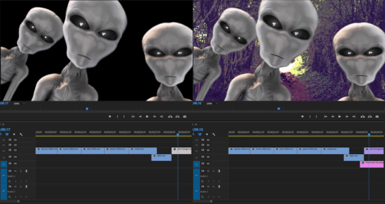
ALIEN GREENSCREEN
When using the alien greenscreen we had to import an image behind to replace the green background, one problem we cam across was the fact the images we took would become blurry when enlarged so Callum ended up finding an image of Sutton park off of the internet.
We then added the audio, this would be the speech for the transport scenes at the start of the film as well as some audio for the aliens. This was probably one of the biggest problems we faced.At first we used a text to speech generator but I didn’t think it made the advert look very good, the voice was very robotic and wouldn’t pronounce certain things correctly. We spent a while trying to find a good text to voice generator without noticing the obvious resolution of having someone recording themselves saying the text. This is when we had James record the speech for us, this worked perfectly, a lot better than I expected.
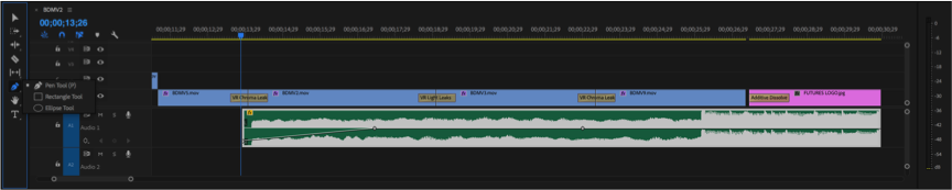
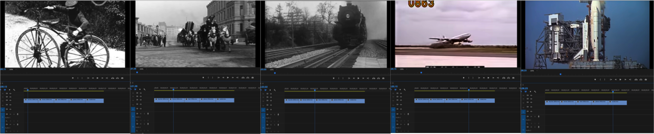
TRANSPORT THROUGH TIME
It took a lot of tweaking the length of the videos and the placement of certain clips to ensure that the length of the advertisement stuck to 30 seconds, as well as everything fitting in with a good amount of time to be shown. Everything fitted perfectly, however we faced another problem.
Upon showing our teacher our completed advertisement we were alerted that maybe people wouldn’t really understand what our advertisement was advertising. With no where to add speech, me and Callum thought it would be a good idea to incorporate our polygraph poster into the advert, the last scene would simply dissolve into this then our logo. This and the fact that I just didn’t think adding more audio would fit in with the advertisement we had already made. The others agreed this was a good idea.
PLANET ADVERTISEMENT AND LOGO
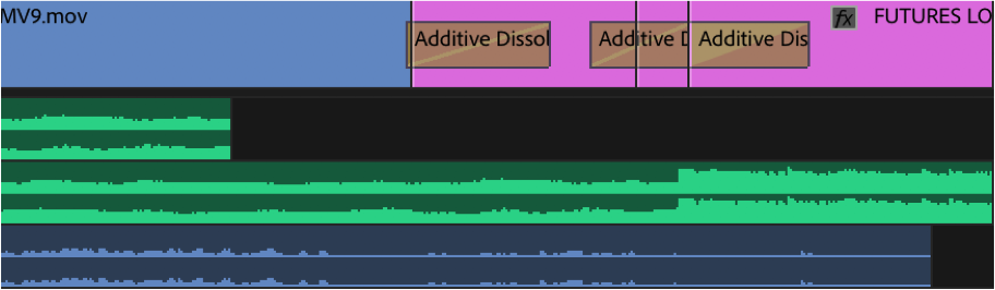
The problem we faced by adding these two extra images was 1, that when adding one image and image that was already on there would delete, and 2, when we added the transition it would change the shape of the planet poster from a rectangle to a square. This doesn’t seem like a big issue but when it dissolves into this image the square shape is highlighted which looked odd.
We resolved both of these issues by moving the images onto different lines on the timeline,and by using a different transition and seeing if that changed the shape. It didn’t, so we changed it to the original transition and it worked fine.
Originally the last recorded scene cut off to black and dissolved into the logo, we wanted the same thing to happen with the planet image. Now, the last recorded scene cuts off and dissolves into the planet, then dissolves to black then dissolves into the logo. We had to add in a plain black image between the two or else it would have dissolved straight from the poster to the logo which didn’t look right.
We didn’t face any major problems when recording this footage, we were trying to go along with our plan that we made beforehand. It was purely our limited amount of time in the park as well as the limited length our advertisement was supposed to be, that made it difficult.
Trying to find the best scenery to record was also difficult because of this reason as it took us 10 minutes to get to somewhere with water. Our footage was limited and weaker than what we expected it to be, however with the effects we used and the Earth likeness of the planet we chose – Gliese 832 c, the footage we ended up with worked well.
Admittedly I did struggle throughout this process in the
aspect of technology being a pain. Sometimes not all of what I created pasted,
the gradient wasn’t positioning correctly, shapes would cut in half, a lot of
basic things that should’ve worked first time didn’t. This wasn’t a major
problem but did however slow down the process as I was increasingly becoming
impatient.
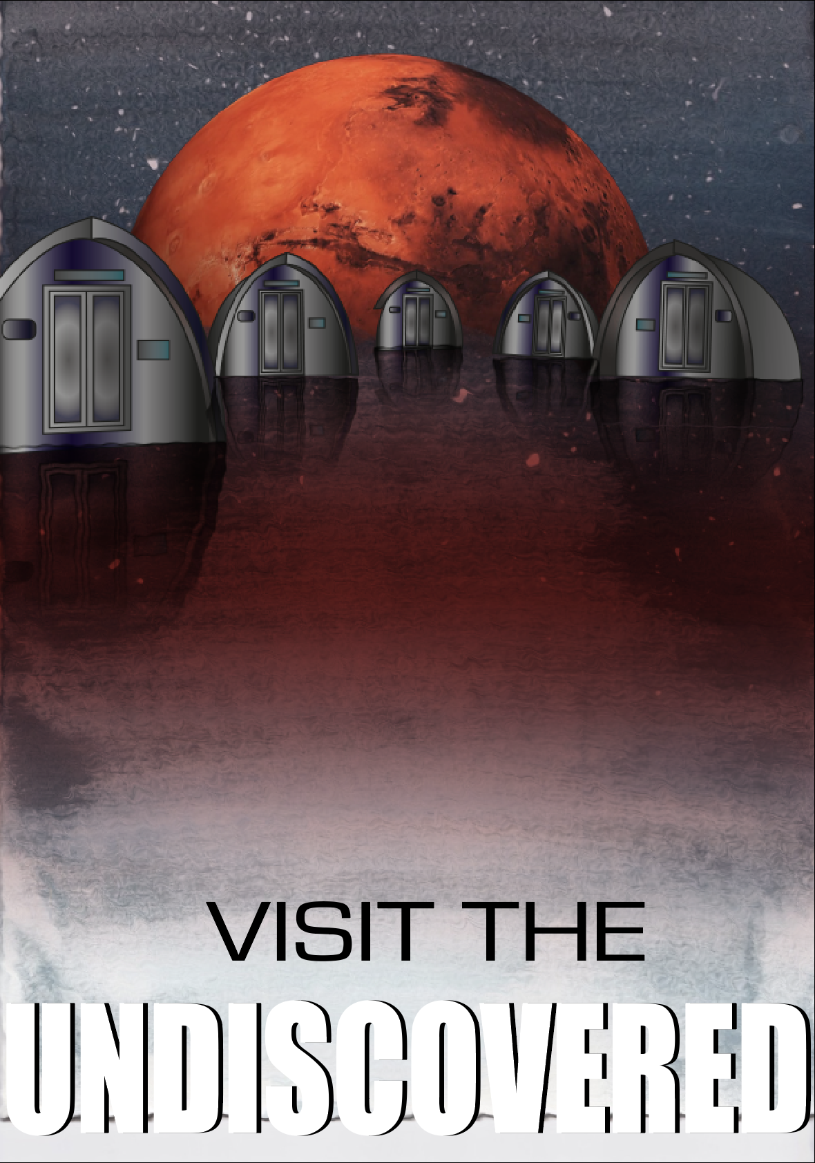
The only real problem I faced was with the surface which the huts are placed on. I tried to create a spherical shape with a planet like texture but this looked odd with the water colour having a water effect. And overall with it looking pretty 2D. The only issue I overcame was with the shape of the planet. By adding the Mars planet in the background, this separated the water part of the background with the sky, which made it more distinct and made it look more natural. I still think it looks slightly 2D, I tried to resolve this by adding the ‘ripple’ effect to the background too, its not too obvious in comparison to without it. The surface would still be pretty flat up close anyway and I think overall, it looks great.
Due to my feedback I changed the layout of the poster to include the logo and a QR code to take you to my blog. This is my poster now:
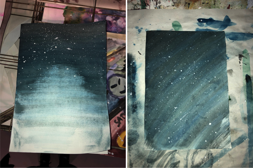
Even though our design was suppose to be more of a watercolour galaxy piece, I attempted to do this 4/5 times but I wasn’t happy with how these turned out. So I went with the aim of creating a sky background. I used the same process for both of these pieces: