Gliese 832 c discovered in 2014, is a planet which orbits a star that is not our sun, and is located approximately 16 light-years away. It receives the same amount of energy as the Earth does from the sun.
It is one of the top three most Earth-like planets and the closest one to Earth out of all three. It has Earth-like temperatures but experiences extreme seasonal shifts
While making our advertisement we realised we didn’t actually have a name for the planet we were advertising. I thought that because of our footage being mainly water sources, trees and grass it would only make sense for the planet to be Earth like. We found one planet which a group was already using which is why we went with Gliese 832 c.
Our Visual Communication project theme was space travel, we didn’t really look into artists as such it was mainly looking at the JPL posters by NASA as well as travel posters in the 1900s. These have influenced my design ideas very loosly, I did use the polygraph design in our space travel poster which I think added a retro feel to it. I also used both of the posters to help me pick an activity for my sketch as well as my poster. I decided to go for a man walking on the moon pulling his suitcase for my sketch and then went for glamping huts in my first travel poster as these weren’t something I’d seen in any of their posters. I enjoyed working on photoshop and using the different tools to create my poster. I mainly used the pen tool to outline the glamping huts as this wouldn’t be something easily made with the shape tool. This was successful however I came across problems where the pen tool wouldn’t line up properly but this was solved by enlarging the work page. Whilst working on this project I learnt a new process to make a poster which was by using the polygon tool, it involved creating triangular shapes on top of a chosen image and using the blur tool to average the colour within that space. I would like to develop this further within my first polygraph poster as I didn’t have chance to finish it completely due to me putting a lot of my extra time into the movie. Me and Callum used this polygraph technique in our advertisement poster as it made it look more unique and retro. We also incorporated a green screen into the movie of aliens, this was suggested by the teacher and we thought this would be a great way to bring out movie to life. I think I enjoyed making the poster the most as it gave us more time to experiment with the polygraph technique as well as experimenting with the 3D text tool on photoshop. I think the most successful part of the project is probably the film as the transitioning and how every works together is very good, me and Callum put a lot of effort to making this movie and it has really payed off, we are very proud of it. It worked out incredibly well even though we did encounter a lot of problems with the voiceover, the transitions due to a fault in the premier, and technical issue to the point where the software would crash. I didn’t really learn anything, it was more just trying daft things to work around the problem like swapping between transitions. This effected the process in general, it took us a lot longer than it should’ve.
Honestly, I would not be with the people that were in my group. Me and Callum did majority of the work due to the other members of the group not participating to the extent that they should have been. Yes, we still managed to do the poster and we still did the movie but there was a massive lack in teamwork on their part. One of the biggest problems we faced was this, trying to resolve issues by ourselves when it’s work for more than 2 people.
As this was a group project I am left very let down by the two people in my group however I am incredibly proud of the effort Callum and I put into this movie as this and the advertisements worked very well considering.
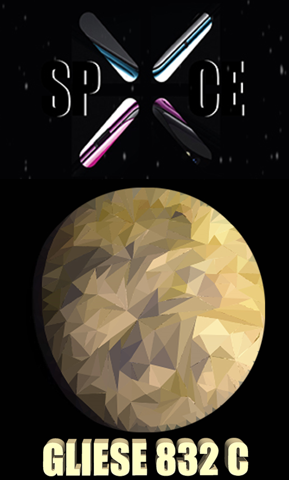
For our advertisement we had to create a poster, due to our polygraph work we did with James I thought using this technique would make this poster more unique as well as adding a retro feel to it.
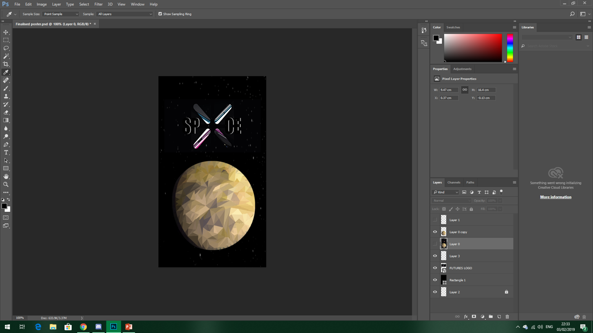
I found an image of Gliese 832 c and used this to create the polygraph planet. I began to use the polygraph method to create the planet, after a quarter of it was done Callum took over as I had to take screenshots of the process for our movie.
There were no problems during this process it just took a bit longer as the triangles around the outline of the planet had to be shorter to make the planet have a smoother edge.
STEP 1
STEP 2
STEP 3
STEP 4
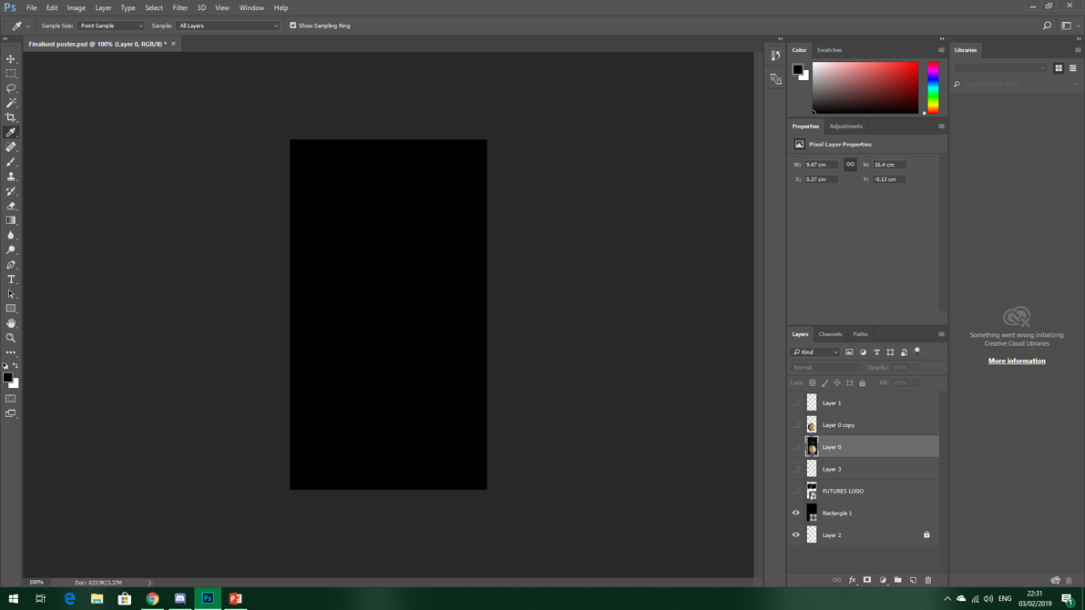
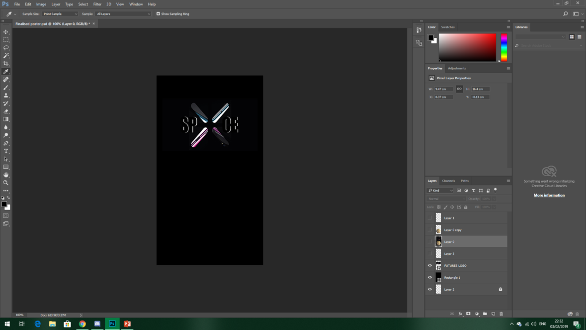
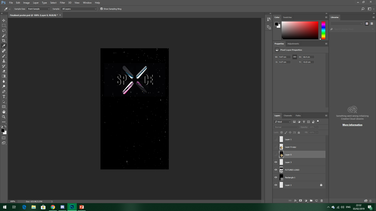
Step 1 – We started with a black background, this is purely because of the background of the ‘X’.
Step 2 – Callum added the SPXCE logo onto the black background on a separate layer.
Step 3 – Callum then added a stary background as another layer.
Step 4 – I started off the polygraph image of the planet Gliese 832 c by using the shape tool and averaging the colour. Callum continued using this process to finish off the poster.
In the darker areas of the planet, like the shaded areas, we struggled to see the triangles we added in, however Callum increased the brightness so this was not a problem.
OUR FINAL POSTER
Finally Iadded 3D writing of ‘GLIESE 832 C’. We used the droplet tool to use one of the lighter colours on the planet. This completed our poster.
However we did end up facing a problem, Callum was taking screenshots of the process of creating the poster but did not save any of these. Even though he did re take the screenshots this did not include the finished poster. As I didn’t have enough time to do this myself I simply took the image from the end of our advertisement and cropped this on top of the last screenshot of the poster we found.
I am very happy with the poster, its simplicity of the layout with the complexity of the polygraph planet looks great!
Recorded footage and effects fit well with the transitions.
Fade out the sound at the end of the movie so it doesn’t end so abruptly.
TARGETS:
Add something to ensure that the audience knows what the short movie is advertising.
Add logo to advertise our company.
Fade out the sound at the end of the movie so it doesn’t end so abruptly.
MET TARGET?
We added speech at the start of the movie talking about advancements in transportation, as well as an alien voice mentioning the planet. We also added part of the poster we created to the end of the movie.
I created a logo for out company – SPXCE. I added this at the end of the movie too
We found it difficult to fade out the sound appropriately with the length of time that the film had to be. For it to sit right throughout the film and fade out at the end would be difficult.
We were introduced to another style which perhaps we could incorporate within our posters. A polygraph poster entailed creating triangular shapes over a selected image and averaging out the colours to create a solid overall colour for the selected area.
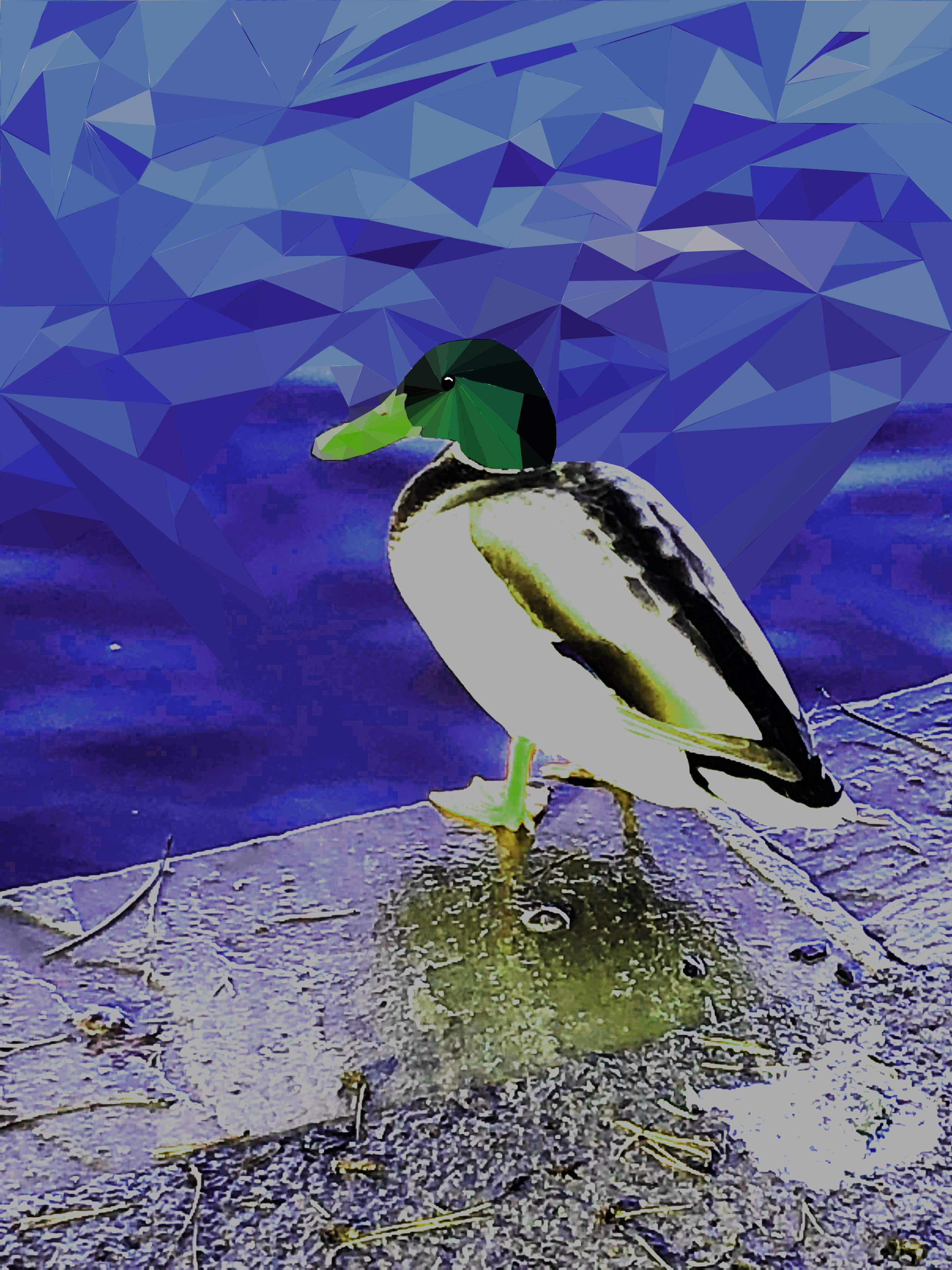
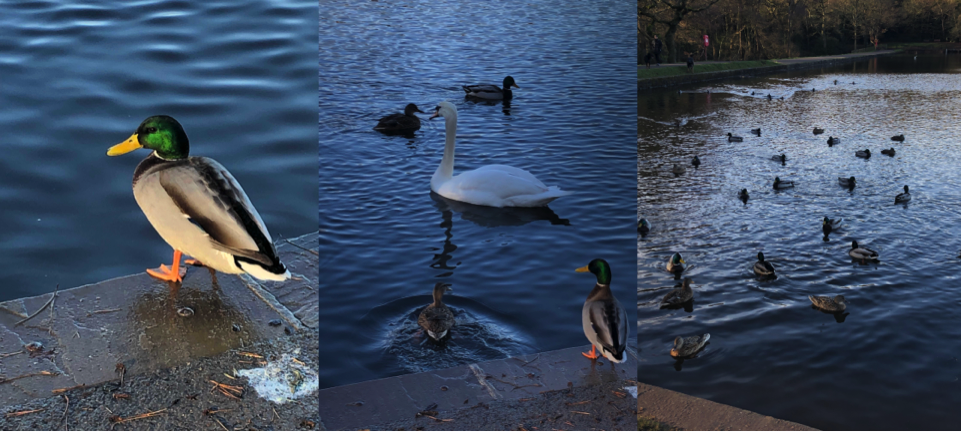
MY PRIMARY IMAGERY OF A DUCK – THE IMAGE I CHOSE FOR MY POLYGRAPH POSTER
This is the image I chose, my plan was to alter the colour of the image to make it more unnatural/’alieny’. I picked this image purely because I think it looks lovely, this is my favourite image that I took while at Sutton Park.
START OF MY POLYGRAPH POSTER
I opened up the image in Photoshop. I used the shape tool to draw my first triangular shape, I then clicked the tab ‘Filter’ at the top, then ‘Blur’ then ‘Average’.Using the average tool would change the shape to a block colour which was the average of the colours within that section. I continued to do this but used the short cut to make the process a lot easier.
As you can see on the picture above, in comparison to the one before it, the colour of the image is a bit more vibrant, it added to the feel of it being a poster for a planet advertisement. I was going to change the colour more instead of it still being their original colours.
This became a problem as I just didn’t end up having enough time to finish it off, my plan was to finish it off while in lesson but the film editing took up all of my time to the point where I just about had enough time to start my blog in lesson. This was purely down to my lack of help with my team members as well as not having access to this software at home.
I wish I had chance to complete this poster to the potential I wanted to complete it in, however I did manage to incorporate this into our planet poster as part of the advertisement.
The logo could’ve been more unique however the ‘X’ had a black background and it was very difficult to remove this smoothly, I tried using tools on Photoshop such as the magic wand and quick selection but this didn’t work. Alternatively I tried to get rid of the background using word but this didn’t work either.
POST MALONE SONG ON TIMELINE
This wasn’t necessarily a problem however it just caused stress for me and Callum as it was yet another task we had to do on top of everything else. The backing track was a task for the other members in our team to do, however they quickly gave up and me and Callum ended up doing it. We skimmed through some of the songs we had on our phones to try and find an’alien’ like backing track.We ended up using the backing track to Post Malone’s Rockstar.
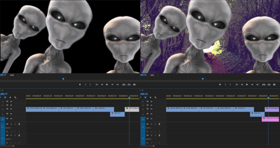
ALIEN GREENSCREEN
When using the alien greenscreen we had to import an image behind to replace the green background, one problem we cam across was the fact the images we took would become blurry when enlarged so Callum ended up finding an image of Sutton park off of the internet.
We then added the audio, this would be the speech for the transport scenes at the start of the film as well as some audio for the aliens. This was probably one of the biggest problems we faced.At first we used a text to speech generator but I didn’t think it made the advert look very good, the voice was very robotic and wouldn’t pronounce certain things correctly. We spent a while trying to find a good text to voice generator without noticing the obvious resolution of having someone recording themselves saying the text. This is when we had James record the speech for us, this worked perfectly, a lot better than I expected.
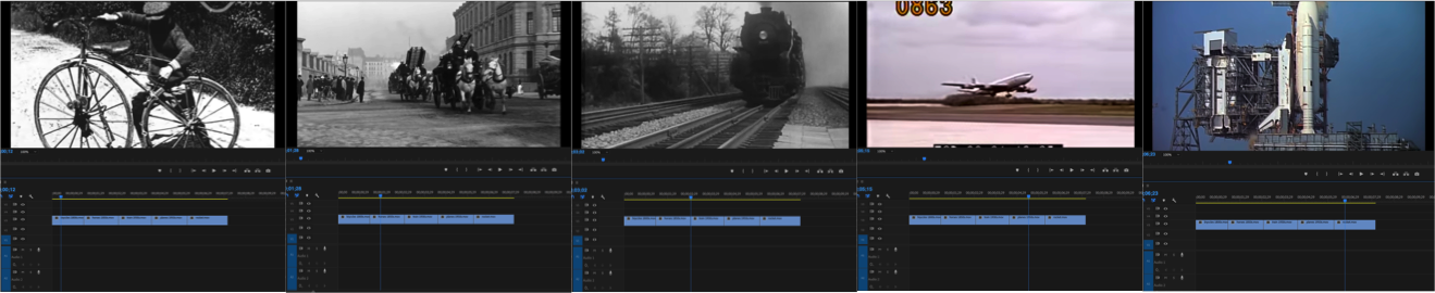
TRANSPORT THROUGH TIME
It took a lot of tweaking the length of the videos and the placement of certain clips to ensure that the length of the advertisement stuck to 30 seconds, as well as everything fitting in with a good amount of time to be shown. Everything fitted perfectly, however we faced another problem.
Upon showing our teacher our completed advertisement we were alerted that maybe people wouldn’t really understand what our advertisement was advertising. With no where to add speech, me and Callum thought it would be a good idea to incorporate our polygraph poster into the advert, the last scene would simply dissolve into this then our logo. This and the fact that I just didn’t think adding more audio would fit in with the advertisement we had already made. The others agreed this was a good idea.
PLANET ADVERTISEMENT AND LOGO
The problem we faced by adding these two extra images was 1, that when adding one image and image that was already on there would delete, and 2, when we added the transition it would change the shape of the planet poster from a rectangle to a square. This doesn’t seem like a big issue but when it dissolves into this image the square shape is highlighted which looked odd.
We resolved both of these issues by moving the images onto different lines on the timeline,and by using a different transition and seeing if that changed the shape. It didn’t, so we changed it to the original transition and it worked fine.
Originally the last recorded scene cut off to black and dissolved into the logo, we wanted the same thing to happen with the planet image. Now, the last recorded scene cuts off and dissolves into the planet, then dissolves to black then dissolves into the logo. We had to add in a plain black image between the two or else it would have dissolved straight from the poster to the logo which didn’t look right.
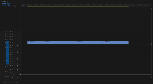
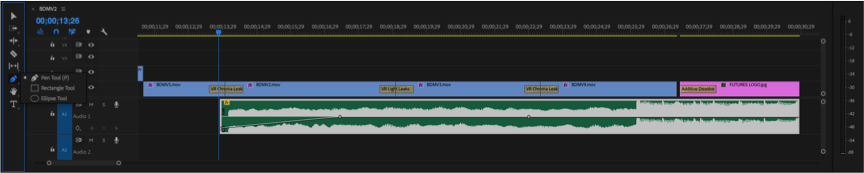
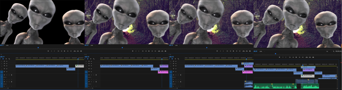
Me and Callum imported our footage onto Premier from external folders, our photos taken in Sutton Coldfield Park primarily as this is the first major bit we needed in the advertisement. After placing the files onto the timeline we trimmed and ordered them. I experimented with different filters – Colour wheels, colour correction and curves to give them an alien feel. It was a group decision on which colour suited each scene best, it was also a group decision for the final clip as it pans upwards, we planned for this to pan upwards into our logo which wasn’t as simple as we planned.We had to import our footage onto Premier
TRANSITIONS
Our next step was to add transitions to the clips. We experimented with different transitions but none of them really fitted well. We then came across VR transitions, we used the VR light leak transition and the VR chroma leak transition. We just experimented with both of these to see which fitted in best with the colour effects we used.
OUR LOGO
In order to advertise our company within the advertisement, we needed a logo. So I found the colourful ‘X’ online and put this onto photoshop and added text ‘SP ‘X’ CE’. I used a basic font and layered black text onto white so only the outline of the letters was visible. We used a generic dissolving transition for the logo so at the end of the last clip it cuts to black and then dissolves into the logo. I think this transition is quite dramatic.
The logo could’ve been more unique however the ‘X’ had a black background and it was very difficult to remove this smoothly, I tried using tools on Photoshop such as the magic wand and quick selection but this didn’t work. Alternatively I tried to get rid of the background using word but this didn’t work either.
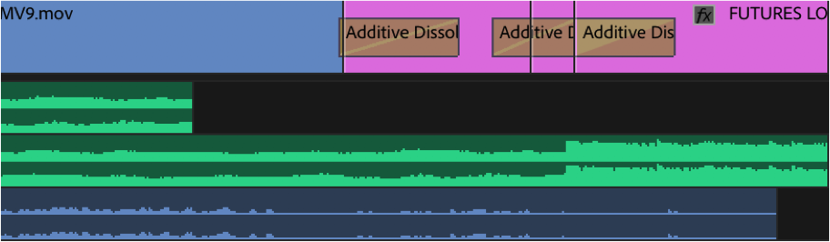
POST MALONE BACKING TRACK – ROCKSTAR ON TIMELINE
The backing track was something that two people in the team were supposed to work on, but they quickly gave up and me and Callum were listening to our songs to try and see if any fitted the theme or the advert. And we swayed more towards the Post Malone Rockstar backing track. The beat kicks in towards the end which is visible in the audio section, we wanted this to come in towards the section were the logo cuts in. This fitted very well and we were very happy with how well it suited the transition.
TRAVEL THROUGH TIME
As the footage we recorded only took up a fraction of the 30 seconds that the length of the advertisement had to be, we had to brainstorm some ideas of how we could make it longer. This is as we came to the realisation that just having 30 seconds of recorded footage would be boring.
I suggested the idea of doing travel through the years, however this would be an issue as we had no idea how to make it link to the footage we filmed – How would it transition smoothly? How would this link to our footage and planet? Then someone in the group wanted to add aliens using a green screen video on YouTube. But again how would we fit this in with the footage we had?
I then suggested that we do our advertisement a little differently to a regular holiday advertisement. Make it more dramatic and intriguing.
My idea as a whole was that the clips of the transport through the years would be an advertisement in themselves. We would have someone talk about the advancement in the technological advancements of transport and then be unexpectedly interrupted by ‘aliens’. This would then go into the recorded footage, then our logo.
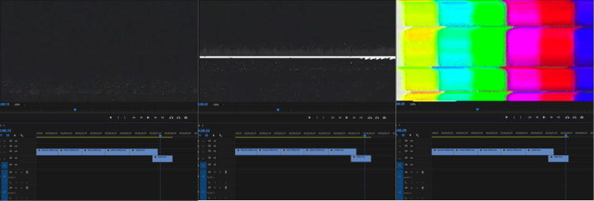
STATIC INTERRUPTION
ALIEN GREEN SCREEN
I found some static videos on YouTube along with static audio and put this after the rocket clip as well as before our recorded footage. Joel found an alien green screen and used a photo of Sutton Coldfield park to put behind it that Callum found, unfortunately we couldn’t use any photos we took as the image would become blurry when enlarged. Joel then put this onto the timeline along with the image but left me to make sure the video of the aliens was the actual size of the screen and that the image of the park wasn’t off the one side.
Me and Callum also put the static scene faintly on top of the alien scene as he usggested.
We then added the audio, this would be the speech for the transport scenes at the start of the film as well as some audio for the aliens. This was probably one of the biggest problems we faced.At first we used a text to speech generator but I didn’t think it made the advert look very good, the voice was very robotic and wouldn’t pronounce certain things correctly. We spent a while trying to find a good text to voice generator without noticing the obvious resolution of having someone recording themselves saying the text. This is when we had James record the speech for us, this worked perfectly, a lot better than I expected.
He recorded the following text:
The history of transport is largely one of technological innovation, advances in technology have allowed people to travel further, explore…
WIKIPEDIA
This was the speech for the clips of the transport up until the interference of the aliens, and this is the text he recorded for what the alien says:
Submit, come to Gliece
OUR OWN TEXT
James tried hard and did a very good job at trying to make his voice sound alien like, however we had already planned to use a voice manipulation site to add an eerie echoing effect to his voice. His hard work aided the effect of the manipulation. We were all very impressed with how it sounded.
It took a lot of tweaking the length of the videos and the placement of certain clips to ensure that the length of the advertisement stuck to 30 seconds, as well as everything fitting in with a good amount of time to be shown. Everything fitted perfectly, however we faced another problem.
Upon showing our teacher our completed advertisement we were alerted that maybe people wouldn’t really understand what our advertisement was advertising. With no where to add speech, me and Callum thought it would be a good idea to incorporate our polygraph poster into the advert, the last scene would simply dissolve into this then our logo. This and the fact that I just didn’t think adding more audio would fit in with the advertisement we had already made. The others agreed this was a good idea.
(Our Planets Poster)
EXTRA AUDIO AND IMAGES
We added the following image to advertise our planet:
PART OF OUR PLANET POSTER
Originally the last recorded scene cut off to black and dissolved into the logo, we wanted the same thing to happen with the planet image. Now, the last recorded scene cuts off and dissolves into the planet, then dissolves to black then dissolves into the logo. We had to add in a plain black image between the two or else it would have dissolved straight from the poster to the logo which didn’t look right.
Finally, because we had added the extra imagery, the placement of the beat kicking in on the audio fell sooner than the appearance of the logo so Callum suggested we extend the starter audio to make up the difference. I added the same audio and cropped out the bit where the beat kicks in. I then used the pen tool to lower the volume of when the audio first starts so it blends in without the obviousness of it being extended.
After weeks of hard work, our advertisement was finally complete.
We didn’t face any major problems when recording this footage, we were trying to go along with our plan that we made beforehand. It was purely our limited amount of time in the park as well as the limited length our advertisement was supposed to be, that made it difficult.
Trying to find the best scenery to record was also difficult because of this reason as it took us 10 minutes to get to somewhere with water. Our footage was limited and weaker than what we expected it to be, however with the effects we used and the Earth likeness of the planet we chose – Gliese 832 c, the footage we ended up with worked well.
Admittedly I did struggle throughout this process in the
aspect of technology being a pain. Sometimes not all of what I created pasted,
the gradient wasn’t positioning correctly, shapes would cut in half, a lot of
basic things that should’ve worked first time didn’t. This wasn’t a major
problem but did however slow down the process as I was increasingly becoming
impatient.
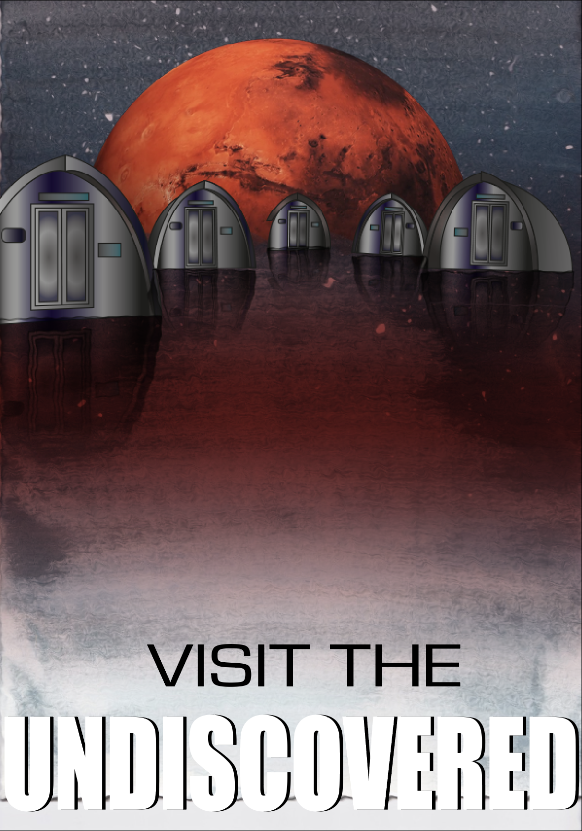
The only real problem I faced was with the surface which the huts are placed on. I tried to create a spherical shape with a planet like texture but this looked odd with the water colour having a water effect. And overall with it looking pretty 2D. The only issue I overcame was with the shape of the planet. By adding the Mars planet in the background, this separated the water part of the background with the sky, which made it more distinct and made it look more natural. I still think it looks slightly 2D, I tried to resolve this by adding the ‘ripple’ effect to the background too, its not too obvious in comparison to without it. The surface would still be pretty flat up close anyway and I think overall, it looks great.
Due to my feedback I changed the layout of the poster to include the logo and a QR code to take you to my blog. This is my poster now:
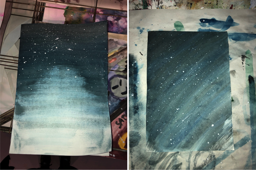
Even though our design was suppose to be more of a watercolour galaxy piece, I attempted to do this 4/5 times but I wasn’t happy with how these turned out. So I went with the aim of creating a sky background. I used the same process for both of these pieces: