Gliese 832 c discovered in 2014, is a planet which orbits a star that is not our sun, and is located approximately 16 light-years away. It receives the same amount of energy as the Earth does from the sun.
It is one of the top three most Earth-like planets and the closest one to Earth out of all three. It has Earth-like temperatures but experiences extreme seasonal shifts
While making our advertisement we realised we didn’t actually have a name for the planet we were advertising. I thought that because of our footage being mainly water sources, trees and grass it would only make sense for the planet to be Earth like. We found one planet which a group was already using which is why we went with Gliese 832 c.
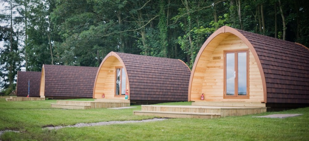
Glamping is pretty much ‘Glamorous Camping’ and describes a style of camping with amenities, and in some cases, resort-style services not usually associated with the traditional camping.
I only chose these glamping huts purely because of the shape and style of them, the shape seems pretty futuristic, and I am happy with how they have ended up looking on my poster.
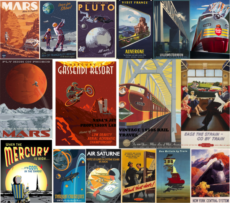
NASA’s Jet Propulsion Laboratory staff have created posters advertising tourism to exoplanets, the the romantic style of 1930’s-era railway posters. This is to get people excited about space science and to build their curiosity. It was suggested to give a similar vintage treatment to amazing destinations in the solar system that JPL are currently exploring .
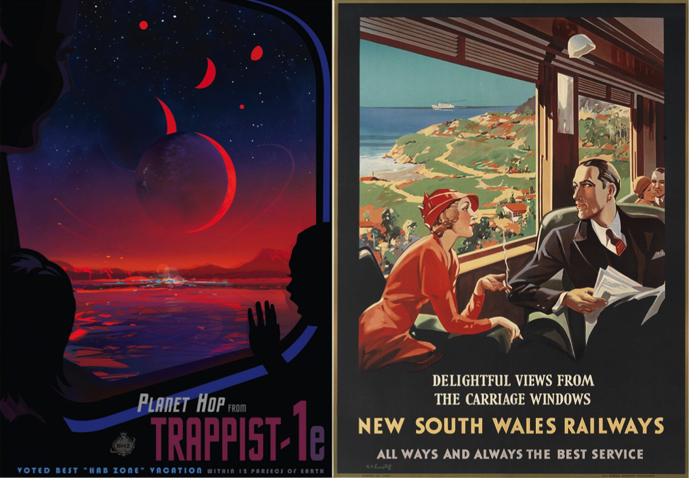
COMPARISON BETWEEN NASA’S JPL POSTER AND A 1930’s RAIL POSTER
This is a visual comparison between a NASA poster and an original 1930’s poster. The situation on both are very similar as they show a scene while travelling, I particularly wanted to find images like these to show distinct differences rather than just the situational ones. The vintage poster has only slightly ben reconstructed for contemporary purposes by NASA. The style is very much the same but the colours and effects are more realistic due to the advancement in technology we have now compared to the 1900’s.
We used these posters to influence our posters as they have basic solid colours which look very attractive and not tacky.
‘The old WPA posters did a really great job delivering a feeling about a far-off destination. They were created at a time when colour photography was not very advanced, in order to capture the beauty of the national parks from a human perspective. These posters show places in our solar system (and beyond) that likewise haven’t been photographed on a human scale yet — or in the case of the exoplanets might never be, at least not for a long time. It seemed a perfect way to help people imagine these strange, new worlds.’
DAVID DELGADO
RETRO FUTURE STYLES – FILMS
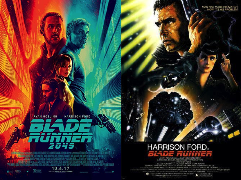
BLADE RUNNER 2049 AND BLADE RUNNER 1 POSTERS
“I was mesmerised by the mix of what was then futuristic with what was already retro, that is what makes Blade Runner the gold standard (among) sci-fi dystopian worlds, as it’s believable. Because we do not live in a world where everything is from today … We live in a chaotic world of various decades of architecture, automotive design and fashion, combining and colliding all (in) that same moment.”
JEREMY SCOTT
In Los Angeles, 2019, Deckard is a Blade Runner, a cop who specialises in terminating replicants. He is forced to come out of retirement when four replicants escape from an off-world colony and come to Earth.
Blade Runner takes inspiration from space travel. The film envisions the future in the year 2019 as bleak, this contrasts with other depictions of the future in film and TV. Blade Runner is famously and loosely based on Philip K. Dick’s ‘Do Androids Dream of Electric Sheep.
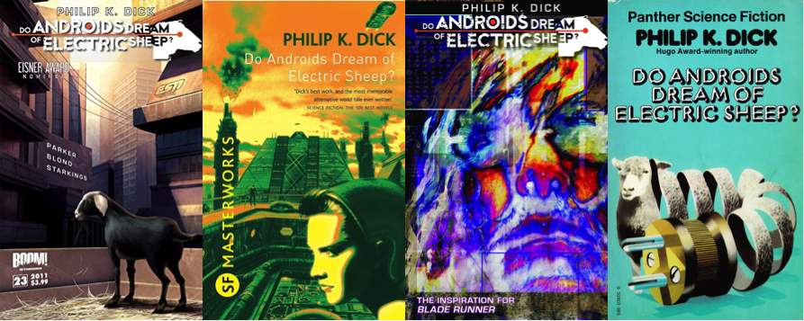
PHILIP K. DICK’S ‘DO ANDROIDS DREAM OF ELECTRIC SHEEP’
Deckard, a bounty hunter, plans to kill enough replicant androids so he can replace his robotic sheep with a real one. In the process he falls in love with an android and learns about himself and what it means to be human and inhuman.
Blade Runner fits into two cinema genres; one science fiction, and the other noir.
NOIR – Is a term used to primarily describe stylish Hollywood crime dramas, particularly those that emphasise cynical attitudes and sexual motivations.
INFLUENCE
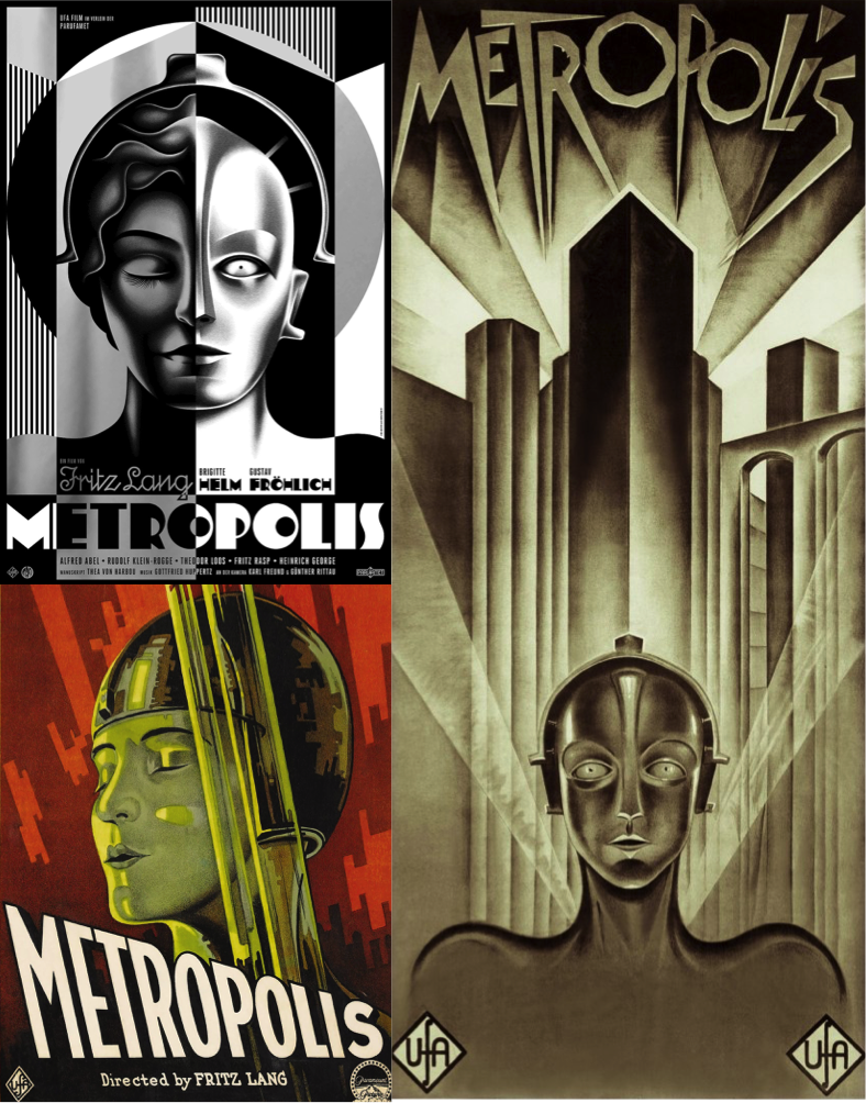
METROPOLIS POSTERS
In iconic films like these, the advertising is very important and needs to represent the film itself; theme included. The retro futuristic styles express their themes perfectly – SCI-FI
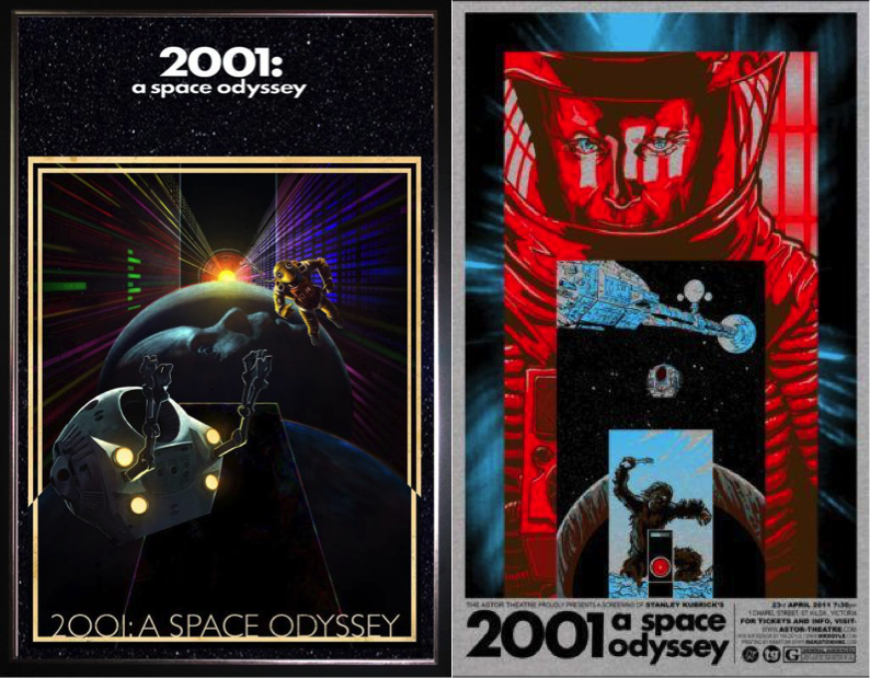
2001 A SPACE ODYESSEY POSTERS
The movies didn’t actually influence our movie at all, it was more of the generalisation of movies where they have a deep voiced man narrating at the start of the movie which influenced our movie. However the JPL posters did influence our poster as we wanted to make it retro.
INSPIRATION
NASA JPL POSTERS
I particularly like the layout of these, the perspectives and retro effects of these posters is something I want to incorporate into my own poster. I want to make my poster look vintage as it looks detailed and modern yet retro.
VERTIGO COVER
The Vertigo poster is probably my favourite poster. I like the contrast in the bright sky to the darkness of the surroundings. The perspective of the poster is also something I like, it makes the scenery seem intimidating, which new surroundings can be. The shading and colours of the poster is also similar to that of the NASA posters and the vintage rail posters.
I also drew an idea for an activity which would be on my poster, I took inspiration from activities you would usually do while on vacation. (DRAWING)