With inspiration from the NASA tourism posters we had to create our own space tourism poster to a planet of our choice; I didn’t have an initial idea of a planet to visit, I didn’t have an idea of what to do at all.
I looked at some of the NASA posters again and took inspiration from this poster in particular.

I like the dark colours – the blue and the black, together with the red and horizon of a yellow/orange. The tourists are looking over what looks like a lake with a city view in the background, this is the layout I decided to go with.
So I scanned in my water colour image that I did previously into Photoshop and added a dark red gradient to it. I chose this image as the fade of the blue towards the bottom of the paper looks like a light reflection onto water. Using a red gradient on this was intended to create the reflection of the colour of Mars.
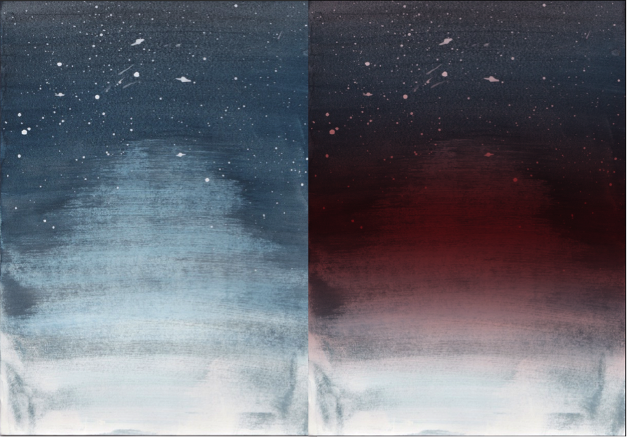
- I created this gradient by using the quick mask tool to select the background, which decreases the selected area, so when a gradient is added (red) it then fades out with the fading of the image.
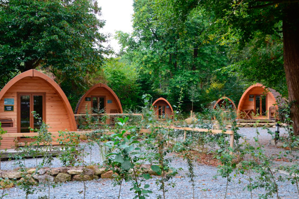
I knew I wanted a landscape to be reflected onto the water, at first I considered a city but I thought this would be too generic. I started to consider different ordinary activities and chose clamping, specifically glamping. This is a more glamorous type of camping. I chose this primarily for the camping huts which have a futuristic shape to them.
2. I then imported this image into illustrator and used the pen tool to draw around the huts. I used a gradient fill to highlight and dim certain areas.
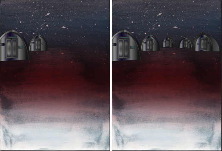
Once I created each hut, I opened what I had made into photoshop. I duplicated each hut individually, flipped them horizontally and clicked ‘filter’,’distort’ then ‘ripple’ to create the ripple effect of the water. I also changed these additional hut layers to have an overlay effect, this faded out the image to make the colours less distinct, like that of a reflection on the water.
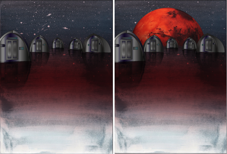
3. I then inserted the red planet into the background so in a sense it is what is creating the red reflection in the ‘water’.
4. Finally, I added text to the bottom of the poster:
‘VISIT THE UNDISCOVERED’

Admittedly I did struggle throughout this process in the aspect of technology being a pain. Sometimes not all of what I created pasted, the gradient wasn’t positioning correctly, shapes would cut in half, a lot of basic things that should’ve worked first time didn’t. This wasn’t a major problem but did however slow down the process as I was increasingly becoming impatient.
The only real problem I faced was with the surface, which the huts are placed on. I tried to create a spherical shape with a planet like texture but this looked odd with the water colour having a water effect. And overall with it looking pretty 2D. The only issue I overcame was with the shape of the planet. By adding the Mars planet in the background, this separated the water part of the background with the sky, which made it more distinct and made it look more natural. I still think it looks slightly 2D, I tried to resolve this by adding the ‘ripple’ effect to the background too, its not too obvious in comparison to without it. The surface would still be pretty flat up close anyway and I think overall, it looks great.
REVIEW: POSTER
I used watercolour and explored ways to create refections – Quickmask, vertical flip and blend modes.
Experimentation with colour and typographical layouts
Linked hut images with glamping
TARGETS:
Add contextual research into glamping
