We used Adobe Illustrator to create this poster;
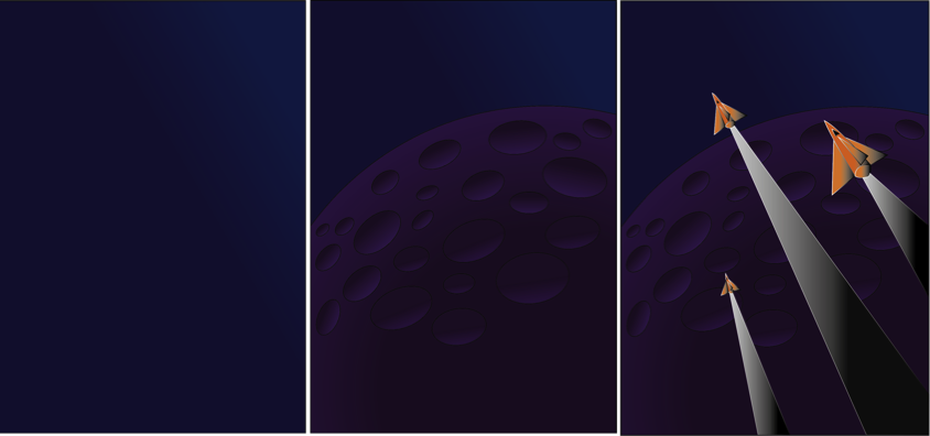
1- I started off by opening a new A4 page and placing the original Pluto poster, and locking this layer, this is so we can use the pen tool to trace around each shape. I then created a second layer which would be the background, I used a dark to light blue gradient to do this as it would be the sky in the final outcome.
2. I then added a third layer in which I used the shape tool to create a circle which would be Pluto. I used a gradient of Dark purple to light purple for this to create the effect of light on the planet. I then created ovals using the shape tool and used the gradient of black to purple to create the 3D effect of the crater.
3. For the rocket, fins and after-burn, I used the pen tool to outline these shapes and then filled the rocket with an orange and black gradient, and the after-burn with a white and black gradient.
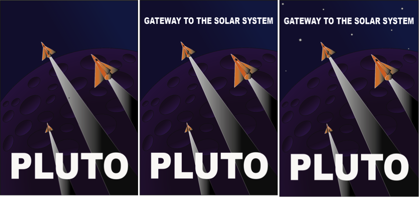
4. I then inserted the text ‘PLUTO’ and changed the font to Arial Black and made this bold. I then sized this to a similar size to the original.
5. I did the same with the ‘GATEWAY TO THE SOLAR SYSTEM’ .
6. I inserted little square shaped and rotated these slightly, these were filled with a black to white gradient.
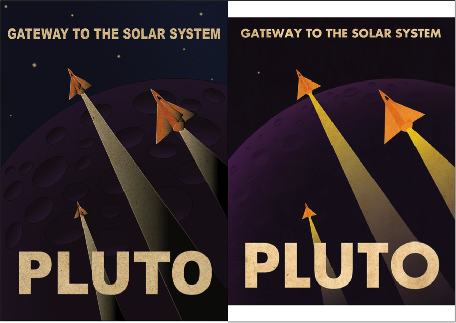
Finally I inserted a layer to give the poster an old effect. I wanted to make it look rustic and this did the job perfectly.
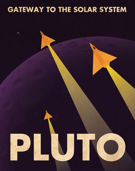
I am very happy with how this turned out as it looks very alike to the original. The only thing I would like to improve would be the planet. Even though I am very impressed with what I did, I think the shading and effects on the original bring out the planet more as a 3D one than mine does. But for my first try I think i did extremely well.
