
We wanted to experiment with two different types of art; watercolour painting and digital manipulation. But first we had to create the water colour base for our work.
Even though our design was suppose to be more of a watercolour galaxy piece, I attempted to do this 4/5 times but I wasn’t happy with how these turned out. So I went with the aim of creating a sky background. I used the same process for both of these pieces:
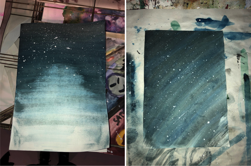
1.I spread a thick layer of water over the paper to start with.
2.I then soaked my paintbrush and put paint on it and squeezed this onto a pallet so it was more of an ink. By doing this I can used a wider dry paintbrush and spread the ink over the paper which will gradually fade as the paint runs out.
3.I started at the top of my page with a blue and went over this about 10 times to make the top darker than the bottom to create a gradient effect. I then mixed the blue with a bit of black and went over it a few more times and then iI just used black by itself.
It was purely by coincidence that my first piece faded in the centre of it, creating a gradient effect but something that you’d see on a lake view. I was very pleased with how this turned out as I think the colours and the gradient effect will look great on my poster, especially when the image is manipulated.
I started from a corner with my second image, I think this would work best with a planet in the bottom right corner. This is at it kind of has a roundish effect which would fit well with the shape of the planet.
Overall I am extremely happy with how these both turned out and I am looking forward to what I can create with them once I have scanned them in onto the computer.
